Background #
Sans-serif fonts has a better readability when scaled down, and thus is the preferred font for figures in many journals.
However, it's not straightforward to typeset math formulas with in the figure, because using a simple \mathsf or \sf can be tricky and tedious. For example, \sf does not affect symbols inside in \mathbf{k}, and you have to use \boldsymbol{\sf k} to make k correctly displayed.
If you search on the web, you can find this heated Stack Overflow thread, where a dozen of different approaches are mentioned. But which one to choose, and why?
Results #
To compare the behavior of different approaches, I'm using the following equation for testing:
\begin{gather*}
\sum abcDFZ\alpha \mu \omega \Gamma \Theta\\
\Psi=\operatorname{det} [
 \mathrm{e}^{\mathrm{i}\mathbf{k}_i\cdot\mathbf{r}_j}
 u_{\mathbf{k}_i}(\mathbf{r}_j)
]
\end{gather*}The results are shown below, and the red symbols are ones that are not rendered correctly.
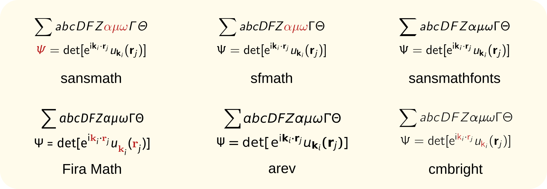
- sansmath: Lowercase Greeks are not in sans-serif, and uppercase Greeks are in ugly slanted style.
- sfmath: Lowercase Greeks are not in sans-serif.
- sansmathfonts: Works perfectly.
- Fira Math:
\mathbfare not in sans-serif. - arev: Works nicely, but a little bit ugly.
- cmbright: Font is too thin, and subscript
\mathbfare not bold.
Conclusion #
Just use sansmathfonts, it's simple and nice.
Code availability #
The code for reproducing the results are available at AllanChain/sans-math-compare.